How to add a metric chart into a report
Reports module communicates with other TeamGuru modules. You can display a metric graph taking data automatically from the system in a report.
The data are downloaded directly from the database, so there is no need to enter any data manually and your charts always display actual values.
If you want to attach a graph, follow the steps below:
1. Go to the slide, click on Add Widget and choose Chart 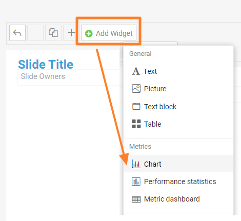
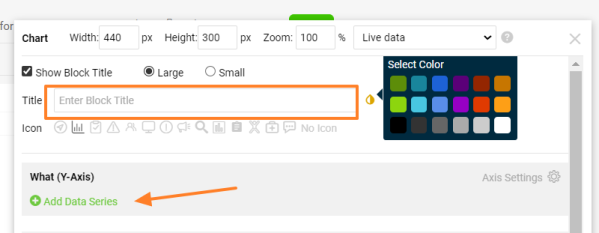
2. Add a Title for your chart, choose color of title, and click on Add Data Series
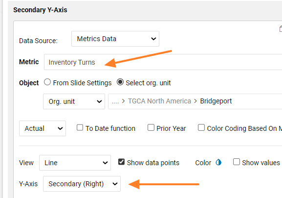
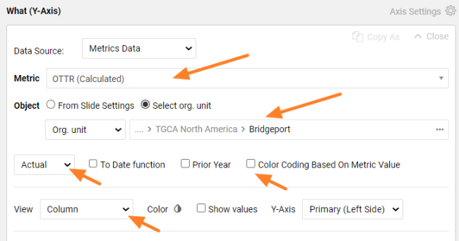
3. Select the metric and organization unit that you want to show. Choose the values that you want to see (actual, plan, trend etc.) and view in chart (column, line, etc). Select Color Coding Based on Metric Value, if you want Red/Green color coding.
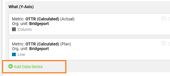
4. Click again on Add Data Series, if you want to show other metric data or org unit in the same chart. You can add as many items as you need.
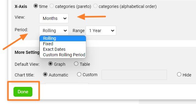
5. Set up X-Axis View and displayed Period. Than click on Done
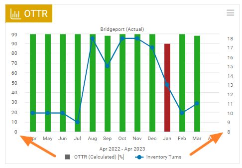
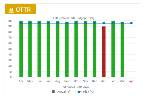
6. The metric chart has been created as example:
7.Click on the Save button to save the slide updates
Tips:
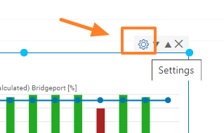
- If you need to change the settings of the existing chart, just click on Settings icon
- You can combine two different metrics in one chart and use 2 Y-Axis settings. When you add new metric serries, choose Y-Axis Secondary (Right).