SQDIP Charts
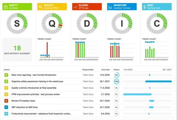
Use SQDIP charts as a visual tool to track performance in Safety, Quality, Delivery, Inventory, and Productivity. It gives your team a clear, real-time view of how operations are performing against targets. Each category highlights where issues or improvements may be needed. By presenting data in a simple, structured format, SQDIP charts help your team react quickly and stay aligned on priorities.
Key features:
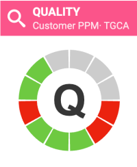
- Clear visual of letter / period grid and trend chart linked to each metric
- Lists all actions tied to that metric from the dashboard for a specific metric / org unit / time period
- Built with any metric or object
- Customizable titles, colors, icons
- Can reference related RCCA and/or 8D
- Easy to move and reorder the metrics
- Charts show actual, plan, forecast values, different time intervals
- Show number of periods without an unachieved objective (e.g. # of days without incident)
- Add a new action directly from your widget
To create the SQDIP widget:
- Go to your report slide and Click to Edit.
- Click Add Widget and select the Metric (SQDIP) widget.

- The widget settings window will pop up and you are ready to customize its design.
1. Enable Show Block Title if you would like to display a title. Then choose the title text, font size, color, and icon. 
2. Add Metrics
A default metric will be displayed. You can then begin configuring it by adding the desired details. To add more metrics, click Add Metric button and define it as well. 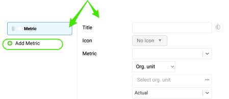
3. Define Metric Settings
a) Choose title, color, icon, metric, org. unit, type interval (actual data, last, next). 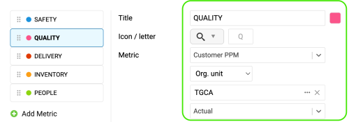
b) Select your metric time interval and the trend chart interval (e.g. daily, weekly, monthly data). 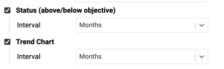
c) Number of periods without an unachieved objective - choose the interval and the title, e.g. # of Days without Accident. . 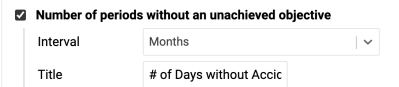
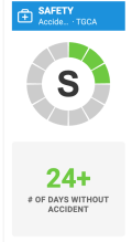
d) Values - display a single metric value for selected time period 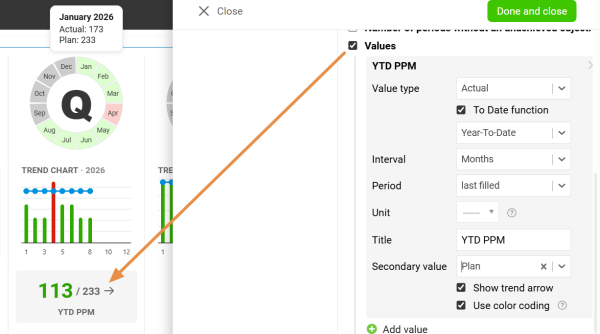
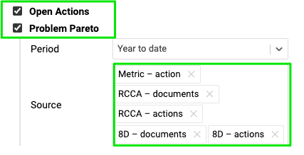
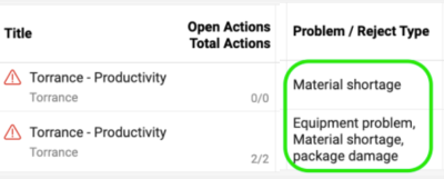
e) Display all open actions for the combination of your metric/org. unit.
Include the Problem Pareto when needed, based on the applicable source documents.

f) Choose Status Visualization - Letter in Circle or Period Grid 
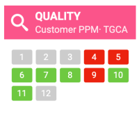
g) Display Open actions as a grid with a timeline and Customize columns.
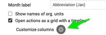
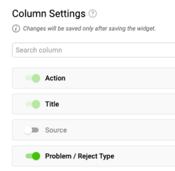

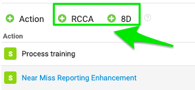
h) You have also options to show Actions from RCCA and 8D documents and show Weekdays only. If you select the option to show actions from RCCA and 8D, you’ll also be able to initiate an RCCA or 8D directly from your slide.

i) Adjust the size of your widget and click Done and Close button.
Additional Features:
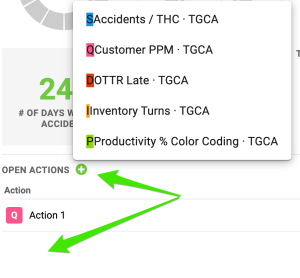
- Add a new actions directly from your widget. Click Add action +, choose the combination and define action settings.
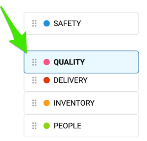
- To reorder your metrics, left-click and hold the metric, drag it to the desired position, and then release the mouse button to drop it.
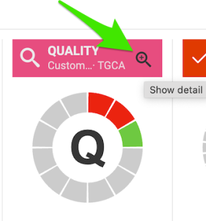
- Show the Trend details. Click on the magnifying glass. It will be available only if you have more than one metric selected in the chart.
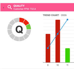
Enjoy clear, easy-to-read charts that provide instant visibility into your metric performance.